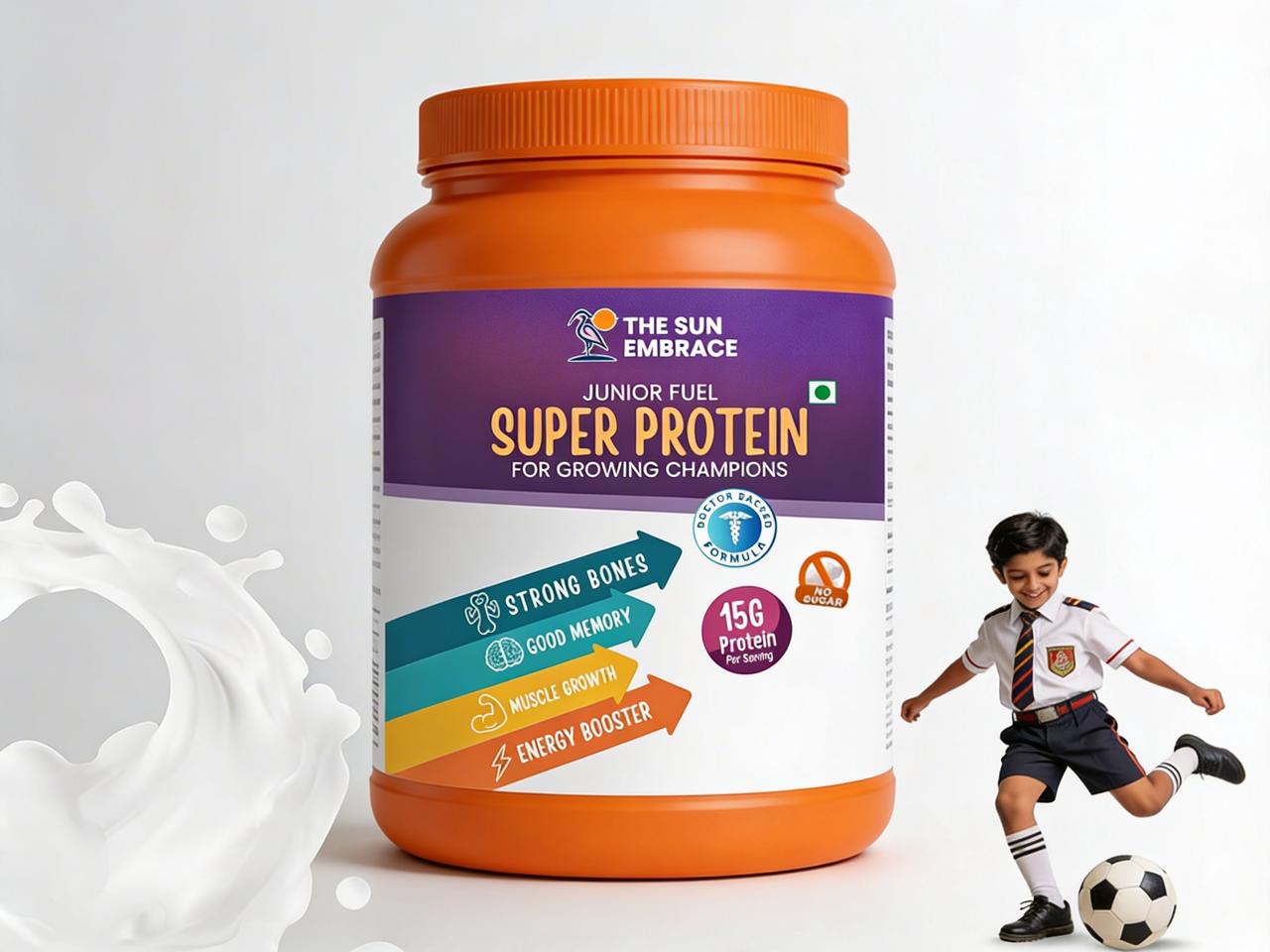
The challenge was to design a supplement packaging that appeals to both children and parents. It needed to communicate strong nutritional benefits like protein intake, growth support, and energy while maintaining a fun, engaging, and trustworthy visual identity in a competitive health segment.
We developed a vibrant and energetic design language using bold colors and playful visual elements to instantly capture attention. Clear typography was used to highlight key benefits such as “Super Protein” and “15g Protein,” while icon-based communication helped simplify complex nutritional messaging for quick understanding.
The design was executed on a jar packaging format with a strong shelf presence. A structured layout ensured all key benefits like strong bones, muscle growth, and energy boost were visually categorized using directional graphics. Supporting elements like “No Added Sugar” and doctor-backed formula were incorporated to build credibility and trust.
The final packaging successfully balanced fun and functionality, making it appealing to kids while reassuring parents. It enhanced product visibility, simplified communication of health benefits, and positioned The Sun Embrace as a reliable and modern nutrition brand for growing children.