
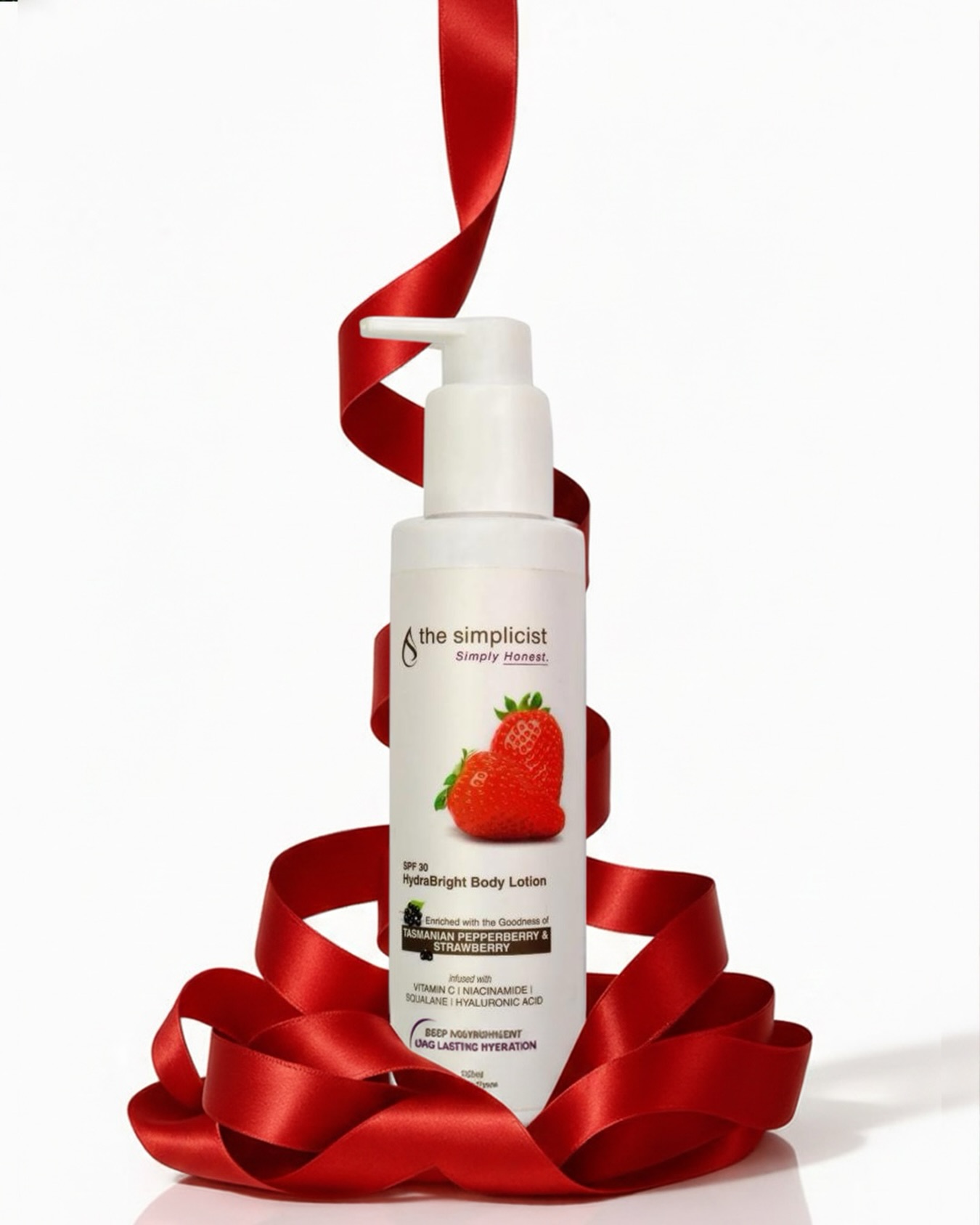
The challenge was to create a brand and packaging system that reflects simplicity while still standing out in a crowded skincare market. It needed to communicate effectiveness, ingredient clarity, and trust without relying on heavy visuals or overwhelming design elements.
We focused on a minimal and clean design language with a strong emphasis on typography and structured layouts. Neutral tones and subtle accents were used to create a refined, modern aesthetic, while clear labeling and hierarchy ensured that product benefits and ingredients remained the focal point.
The design was executed across multiple product formats, maintaining consistency in layout, typography, and color usage. Each product was designed to clearly highlight its purpose, key ingredients, and benefits, ensuring ease of understanding while reinforcing the brand’s promise of simplicity and effectiveness.
The final outcome positioned The Simplicist as a clean, modern, and trustworthy skincare brand. The packaging enhanced clarity, improved shelf presence, and created a strong identity that appeals to conscious consumers seeking effective, no-nonsense skincare solutions.