The challenge was to create a skincare packaging identity that reflects purity, effectiveness, and trust while standing out in a saturated beauty market. It needed to communicate anti-aging benefits clearly while maintaining a calm, natural, and premium aesthetic.
We adopted a nature-inspired design language using earthy green tones and soft visual elements to convey freshness and purity. Minimal typography and clean layouts were used to create a premium feel, while subtle botanical graphics reinforced the brand’s connection to natural ingredients and skincare wellness.
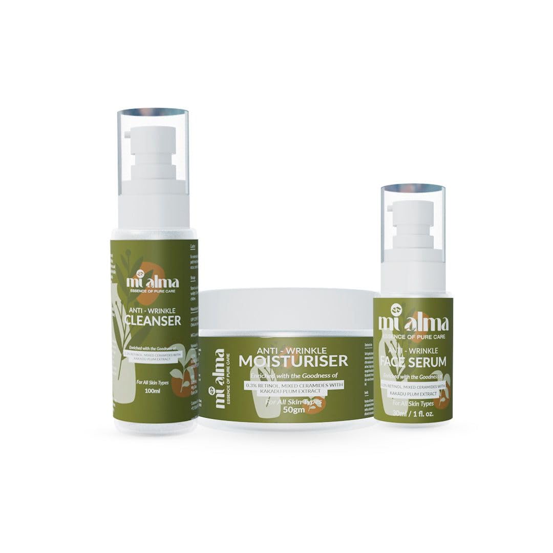
The design was applied across a cohesive product range including cleanser, moisturiser, and serum. Consistent branding elements ensured strong shelf recognition, while clear labeling highlighted key benefits like anti-wrinkle care and skin nourishment. The packaging balanced elegance with functionality, making it suitable for modern skincare consumers.
The final outcome delivered a refined and trustworthy brand presence that resonates with conscious consumers. It enhanced visual appeal, strengthened product positioning in the premium skincare segment, and created a cohesive identity across the entire product line.